The Susceptible-Infected-Recovered (SIR) model is a fundamental concept in epidemiology, offering insights into how diseases spread and recede in populations over time through a relatively simply set of functions. For this ThuRsday Tutorial, we’ll cover how to not only make a quick SIR model but also how to graph the results. If you’d like a decent background on what all goes into the SIR model conceptually and mathematically, please check out our Epi Explained article for Understanding SIR Models. Now, let’s get to coding. As usual, if you’d like to play with the code on your own, you can download it through Cody’s Github.
Step 1: Installing and Loading Necessary Libraries
We have to start with setting up the Python environment by installing and importing the necessary libraries. For this tutorial, we’ll utilize numpy for numerical operations, scipy for solving differential equations, and plotly for interactive visualizations.
numpyis crucial for handling arrays and mathematical functions.scipyoffers powerful options for numerical integration and solving differential equations, playing a pivotal role in our model’s computation.plotlyenables the creation of dynamic plots, allowing us to present the SIR model’s dynamics, as well as allow for users to see more minute details that otherwise wouldn’t be available.
Step 2: Defining the SIR Model
The essence of the SIR model lies in its compartmental approach, segmenting the population into Susceptible (S), Infected (I), and Recovered (R) groups. The transitions between these states are governed by differential equations. Here’s the Python function that does all the mathematical heavy lifting:
In this function:
variablesholds the current counts of Susceptible, Infected, and Recovered individuals.N,beta, andgammarepresent the total population, infection rate, and recovery rate, respectively.
Step 3: Initial Conditions, Parameters, and Solving
Prior to solving the model, initial conditions (i.e., initial numbers of S, I, R individuals) and parameters (beta and gamma) need specification. In our scenario, we consider a population of 1000, with a single initial infection. These parameters are flexible and should reflect the specific disease dynamics being modeled, as well as your population of interest. The differential equations are solved using scipy.integrate.odeint, yielding the system’s evolution over time.
Step 4: Visualizing the Outcome with Plotly
The culmination of our efforts is visualizing the disease’s progression. By leveraging plotly, we transform our model’s output into an interactive graph, offering a clear and engaging depiction of the epidemic’s dynamics.
Creating a plot in plotly involves adding traces for each population compartment (S, I, R), each with its distinct color and style, facilitating an intuitive grasp of the model’s implications.
It should be noted that in Python, graphs often require initialization (hence the empty go.Figure() call). Otherwise, a lot of this code is actually very similar to how R handles graphing if you are familiar with that. Below is our interactive output:
Conclusion
Through this tutorial, we’ve navigated the implementation and visualization of the SIR model using Python, showcasing the model’s utility in understanding infectious disease dynamics. While the SIR model provides a foundational perspective, it simplifies real-world complexities such as population heterogeneity and spatial dynamics. Future tutorials will explore more nuanced models like SEIR and network-based models, offering a deeper dive into epidemiological modeling.
Humanities Moment
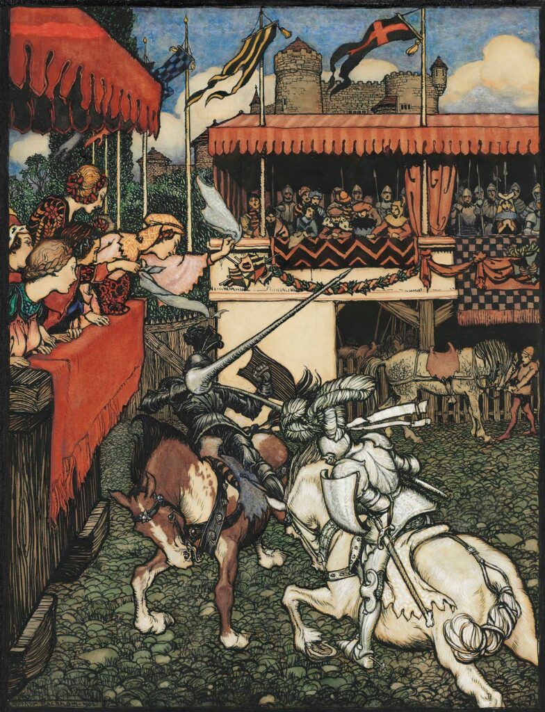
This PyFriday Tutorial’s featured image is Sir Tristram defeats Sir Palamedes in Ireland (1902) by
Arthur Rackham (English, 1867-1939). Arthur Rackham, a pivotal figure in the Golden Age of British book illustration, is celebrated for his distinct pen and ink drawings enhanced with watercolour, a skill refined from his journalistic illustration background. His innovative use of colour-separated printing for the Early American tale marked a significant advancement in book production. Rackham is best known for his illustrations in classics like Rip Van Winkle, Peter Pan in Kensington Gardens, and the Fairy Tales of the Brothers Grimm. After starting his career in journalism and illustration, Rackham fully committed to book illustration by 1894, achieving fame with his unique style, especially after the publication of Rip Van Winkle in 1905. He lived and worked in various locations around London and Surrey, contributing significantly to children’s literature until his death in 1939.