
Correlation is a statistical measure that describes the extent to which two variables change together. In epidemiological data analysis, understanding correlation helps in identifying relationships between variables. This tutorial will guide you through calculating and visualizing correlation using R.
Understanding Correlation in Epidemiology: Context and Limitations
Before we cover correlation analysis in R, we should first establish what correlation is, what types of correlation exist, potential uses and the limitations of the measure. This understanding is crucial for applying correlation analysis appropriately and interpreting its results accurately in any context, but especially when it comes to research that might directly impact the lives of entire populations.
What is Correlation?
Correlation is a measure that illustrates the degree to which two variables are associated with each other. For example, one might look into an association between environmental factors (like air pollution levels) and health outcomes (such as asthma rates). Understanding these correlations is fundamental in identifying potential risk factors and health trends.
What are the Types of Correlation?
- Positive Correlation: If an increase in one variable (e.g., tobacco use) tends to be associated with an increase in another (like lung cancer incidence), this is positive correlation.
- Negative Correlation: Conversely, a negative correlation occurs when an increase in one variable (e.g., vaccination rates) is associated with a decrease in another (like the incidence of the targeted infectious disease).
- No Correlation: There are instances where no discernible pattern exists between two variables, suggesting no apparent relationship.
Generally, correlation is denoted as ‘r’, with a value from -1 (total negative correlation) to +1 (total positive correlation), with values closer to 0 being seen as having little or no correlation. It should be noted though that what might constitutes a weak correlation or no correlation will likely depend on multiple factors.
Relevance in Epidemiological Studies
Correlation is a vital statistical tool in epidemiology for:
- Identifying Risk Factors: It helps in detecting potential risk factors associated with diseases.
- Public Health Planning: Correlation studies inform preventive strategies and healthcare interventions.
- Hypothesis Generation: Observing correlations can lead to generating hypotheses for causal research or avenues for intervention.
Key Limitations in Correlation Analysis
As with any statistical measure, the value of correlation can vary and comes with significant caveats:
- Correlation Does Not Imply Causation: A fundamental limitation is that a correlation between two variables does not necessarily mean one causes the other. Confounding factors often play a role.
- Susceptibility to Outliers: Correlation can be skewed by outliers, leading to misleading conclusions.
- Simplification of Complex Relationships: Many health outcomes are influenced by multiple factors, and simple correlation may oversimplify these relationships.
For more information on Correlation, please check out our Epi Explained article on Correlation.
How to Perform a Correlation in R
With the key background out of the way, let’s dig into how to do a correlation in R with some data that is similar to what you may encounter in the field. If you’d like to follow along with the code, please check out Cody’s Github and download the folder for the Correlation Tutorial.
Our task during this tutorial is fairly simple. You have been assigned a quick analysis to see if there is a correlation between people getting sick with Cholera or Influenza and their proximity to a suspected source of illness, Well A. Ideally, we can look at the raw correlation figure, as well as do some graphing that can illustrate any potential relationships.
Step 1: Read in the Libraries and Data.
Starting out, let’s first install some key packages and then read them into the environment. Please note this tutorial assumes you already have R and RStudio/Posit installed, and if you’ve yet to do so, please do so now.
Packages are basically bundles of code, functions and data that can be imported into your project that don’t require you to do everything by hand. Here, we’re importing ggplot2 for some static graphs that one could copy and paste into a report as an image file, plotly for some interactive graphs that allow for closer examination of details, and dplyr for some additional data analysis functionality.
Next, we need to read in our data. this is fairly simple as we call the “read.csv” function, and tell it to go into the Data folder, and in that folder find our “disease_dataset”.
We can take a look at what we’re dealing with now.
Step 2: Data Examination and Cleaning
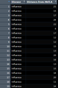 As we can see, we have two columns, one with the name of the disease and the other with the distance of the well marked. Further looking into it, there appears to be 3 noted diseases, both influenza and cholera which we expected, as well as a group called “No Enteric Diseases”. These entries aren’t particularly of use to us, so we can ignore them. What we can’t really ignore is that the data isn’t formulated in a way that makes life easy for us. To do a proper correlation, we will need to do the following steps:
- Separate out the diseases into unique groups.
- Take these groups and see if they can be further grouped together by distance to Well A.
- Summarize the number of visits by distance.
To do this, we can write what’s known as a function. Functions are pieces of code that can be used for the same purpose more than once, and are a great way to shorten up analysis files.
Here we’ve created out function, “Group_by_Distance”. The function itself takes in df, which is any dataframe, and a string called Disease_String which in our use case will be “Cholera” or “Influenza”. The function then takes this string and filters down the dataframe by finding matched inside the dataframes Disease column, and returning all columns from that (hence the comma before the end bracket). From there, we take that filtered dataframe and organize it into groups of data depending on the distance value, and finally count the number of data points within each subgroup.
We then call our function on our Dis_Data dataframe, to create both Cholera_Distance and Flu_Distance, which have the distance as the first column, and then the count of occurrences of the disease as the next column.
Correlation and Graphing
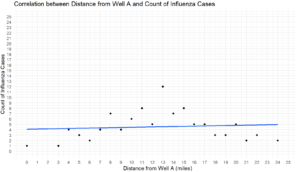
Once our data is all set up, correlation is a remarkably easy task. We can just call the cor() function within base R and print the results as follows, or assign the value to a variable.
We can see that the correlation between flu and distance from the well is very weak at .09, indicating no real correlation is taking place. That said, Cholera has a decent negative correlation of -0.47, which indicates that the farther someone is away from the well, they are also less likely to get sick with cholera.
Say though that simple figures aren’t quite enough and we need some graphs to put into a report, and an additional graph another Epidemiologist can interact with for more detailed information. We can finally play with ggplot2 and Plotly a bit. First, let’s knock out the ggplot graphs.
There’s a lot going on with the code segment above, so let’s break it down. For both graphs, we’re first calling the ggplot function to create a graph. Next, we’re stating we want to use our newly created dataframes data, with the X axis being the distance column, and the y axis being the count of cases. We’re then adding the geom_point function in to dot out where the cases are, and then a geom_smooth command with a linear regression method to show a general trend line, without any confidence intervals (these topics will be covered in later articles). The last steps are ensuring that both X and Y axes are continuous in nature, so they’re normal counts with limits of 25 each, with each axis starting at 0 before going to 25. Lastly, we create some labels to make our graph easier to read.
Lastly, we can do a similar operation using plotly to create some interactive graphs. It should look very similar, with the exception being the “~”, which is a formula indicator mark.
This can then be printed, or used in a dashboard, or embedded like it is here.
Conclusion
In this tutorial, we’ve covered:
- Correlation as a concept
- How to read in real-world data
- How to clean and prepare that data for analysis
- How to calculate Correlation in R
- How to Graph Correlation in R
If you’ve found this article helpful, please feel free to drop by again next and every Thursday for another ThuRsday Tutorial. Or, check in every day for new research, core concepts, and programming content.
Humanities Moment
The featured image of this article is Still Life with Books and a Violin (1628) by Jan Davidsz de Heem (Dutch, 1606-1684). De Heem, renowned as one of the Netherlands’ greatest still life painters, was celebrated for his vivid color harmony and precise depiction of various objects, ranging from flowers and fruits to lobsters and butterflies. His work, known for its opulence and often carrying moral messages, ranged from abundant displays to simple arrangements, frequently incorporating symbolic elements like skulls and chalices to reflect on life, death, and salvation.