
PyFriday Tutorial: How to Calculate Prevalence Rates in Python
Welcome to another edition of PyFriday! Today, we’re diving into a practical data analysis project that covers a foundational skill: calculating prevalence. Imagine you’re a junior epidemiologist, and your manager has tasked you with calculating the prevalence of depression in various regions across several years. Additionally, you are asked to provide a detailed analysis of the average prevalence by region and year.
By the end of this guide, you’ll be well-equipped to handle similar epidemiological tasks using Python. As usual, if you want to follow along with the data and code, check out Cody’s Github. Let’s get started!
Key Takeaways
In this PyFriday tutorial, we’ll walk through a complete data analysis process, from cleaning the dataset to calculating and visualizing depression prevalence. Here are the key steps we will cover:
- Data Cleaning: Verify the dataset, check for missing values, and ensure proper data types.
- Calculating Prevalence: Use the prevalence formula to add a new column showing depression rates as a percentage of the population.
- Average Prevalence Analysis: Group data by year and region to calculate average prevalence rates.
- Data Visualization: Create line and bar plots to effectively communicate the results.
Conceptual Background: What is Prevalence?
Before diving into the code, let’s take a moment to understand the concept of prevalence. In epidemiology, prevalence refers to the proportion of individuals in a population who have a particular disease or condition at a specific point in time. It’s usually expressed as a percentage.
The formula for calculating prevalence is straightforward:
Prevalence Formula: [math]\left( \frac{{\text{{Diagnosed Depression Cases}}}}{{\text{{Total Population}}}} \right) \times 100[/math]
This formula gives us the percentage of the population diagnosed with depression in a specific region during a specific year. Now, let’s implement this in Python step-by-step.
Step 0: Setting Up the Environment
The first step in any data analysis project is setting up your environment by importing the necessary libraries. In this case, we’ll use pandas for data manipulation and matplotlib for visualizations. we’ll use the as method to rename how we reference these libraries for sake of shortening names and keeping the code cleaner. After that, we load the data from a CSV file containing population and depression diagnosis data for various regions and years. We use a file path variable to make it easy to adjust the path as needed.
In this chunk, we import our libraries and load the data using pandas. The dataset contains columns for the year, region, total population, and diagnosed depression cases.
Step 1: Cleaning the Data
Data cleaning is an essential part of any analysis process. We need to ensure that the data is free from inconsistencies such as missing values or incorrect data types before performing calculations. Let’s walk through the cleaning process.
1.1 Checking for Missing Values
We begin by checking for missing values using isnull().sum(), which flags every null value, and then sums up the number of flagged entries by column. Missing values can interfere with calculations, and identifying them early allows us to decide how to handle them (e.g., removing or imputing data).
The output will show the number of missing values in each column. If there are any, it’s crucial to clean or fill them before moving forward.Thankfully for us, there are no missing values in this data set.
1.2 Verifying Data Types
Next, we check the data types of each column using dtypes. The population and diagnosed cases columns should be numeric, as we’ll be performing calculations on these fields. If they are not in the right format, we need to convert them.
If any columns contain incorrect data types (e.g., strings instead of numbers), calculations won’t work properly. By verifying the data types, we ensure that the dataset is ready for the next steps.
1.3 Converting Population and Depression Cases to Float
Even if the data is numeric, it might be in integer form. To ensure precision in our calculations, particularly when working with percentages, it’s best to convert these values into float format.
This step is optional but highly recommended. Converting the data to float helps with precision, especially when dealing with large datasets.
Step 2: Calculating Depression Prevalence
Now that we’ve cleaned the data, it’s time to calculate the prevalence of depression for each region and year. As discussed earlier, the formula for prevalence is:
Prevalence Formula: [math]\left( \frac{{\text{{Diagnosed Depression Cases}}}}{{\text{{Total Population}}}} \right) \times 100[/math]
This will give us the percentage of people in each region diagnosed with depression. We’ll add a new column, Prevalence (%), to our dataset for easier analysis.
This chunk of code adds a new column that contains the prevalence of depression as a percentage. Now, for each row in the dataset, we can see how many people were diagnosed with depression relative to the total population for that specific region and year.
Step 3: Analyzing Prevalence by Year and Region
Having calculated the prevalence of depression, your manager now asks you to summarize this data by finding the average prevalence for each year and region. Let’s break this down into two parts.
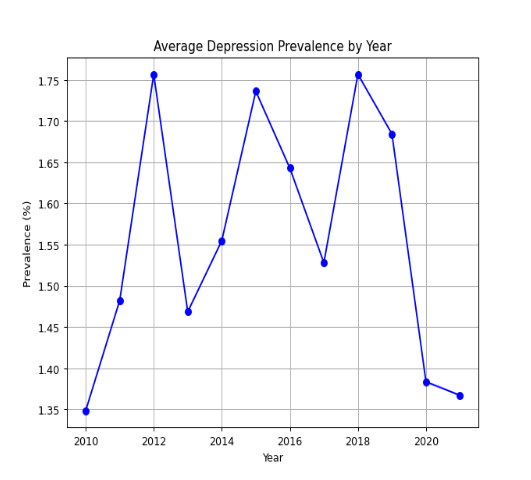
3.1 Average Prevalence by Year
First, we want to calculate how the average prevalence of depression has changed over the years. To do this, we group the data by Year and calculate the mean prevalence. It should be noted that .reset_index() essentially allows for all the grouping operations to take place on the DataFrame, but then return the DataFrame back to normal after the variable assignment.
This code generates a new table that shows the average depression prevalence for each year. By examining this table, you can spot trends, such as whether depression rates are increasing or decreasing over time.
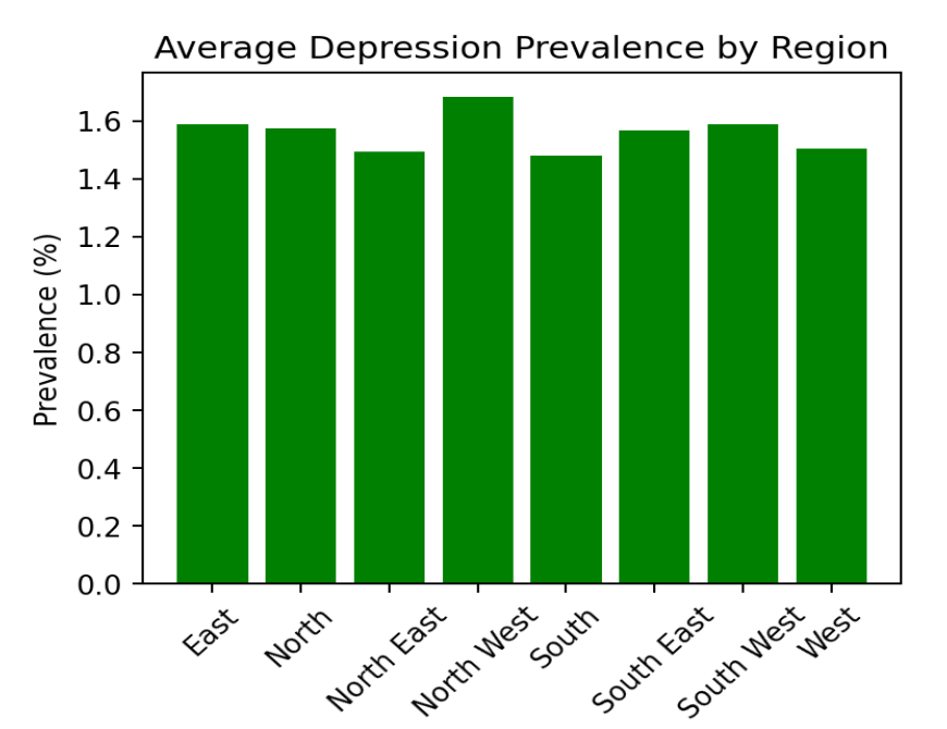
3.2 Average Prevalence by Region
Next, we analyze how prevalence varies across different regions. Grouping the data by Region and calculating the mean allows us to compare which regions are most affected by depression.
The resulting table shows the average depression prevalence for each region. This information is valuable for understanding which areas might require more attention in terms of mental health resources.
Step 4: Visualizing the Results
While tables and statistics provide valuable insights, visualizing the data helps communicate findings more effectively. We’ll use matplotlib to create two key visualizations: a line plot for prevalence over the years and a bar plot for prevalence by region.
4.1 Line Plot: Depression Prevalence by Year
The first visualization is a line plot showing how depression prevalence has evolved over time. This plot is useful for identifying long-term trends in the data.
The line plot shows the average prevalence for each year in our dataset. Line graphs allow for easy trend identification, such as spotting whether the prevalence of depression is rising or falling and identify any sudden spikes or drops in the trend. For more complex data points or composite trends, having a trend line may be useful.
4.2 Bar Plot: Depression Prevalence by Region
Next, we create a bar plot to compare depression prevalence across different regions. Bar plots are particularly effective for comparing categorical data like regions.
The bar plot shows the average prevalence of depression for each region. This visualization allows you to quickly compare which regions have higher or lower rates of depression. It’s also useful for identifying regions that might need targeted public health interventions.
Conclusion:
This project provides a solid foundation for analyzing public health data using Python. Whether you’re studying epidemiology or working in the field, being able to calculate prevalence rates and present data visually is a crucial skill. You can now apply these techniques to other datasets and health-related challenges!
Humanities Moment
The featured image for this PyFriday Tutorial is Sleepy Kittens (1900) by Henriëtte Ronner-Knip (Dutch, 1821 – 1909). Henriëtte Ronner-Knip was a Dutch-Belgian Romantic artist renowned for her animal paintings, particularly of cats. Born into a family of artists, she became the primary financial supporter of her family, gained recognition for her work, and exhibited internationally, earning prestigious awards like the Order of Leopold and the Order of Orange-Nassau.
Enjoy this tutorial? Please consider looking at our other offerings here at Broadly Epi!