
PyFriday Tutorial: Analyzing Incidence Rates and Yearly Changes in Python
Welcome to another PyFriday tutorial! Today, we are focusing on calculating and analyzing incidence rates of depression across multiple regions and years. Imagine you are a junior epidemiologist, and your manager has asked you to not only determine the yearly incidence rates of depression for several regions but also analyze how these rates change from year to year. This type of analysis is crucial in public health for understanding trends in disease spread and the effectiveness of interventions over time.
In this tutorial, we will walk you through the step-by-step process of calculating incidence rates, determining yearly changes, and visualizing the data. By the end of this guide, you will have the skills to carry out similar analyses using Python for various public health scenarios. As usual, if you’d like to follow along with this tutorial, download it and the associated data from Cody’s Github.
Key Takeaways
Throughout this tutorial, we’ll cover the step-by-step process of calculating incidence rates and year-over-year changes in incidence rates using Python. Here are some key takeaways you should have by the end of this PyFriday Tutorial:
- Data Cleaning: Properly cleaning and formatting data is essential for accurate analysis. This includes handling missing values and verifying data types. You’ll be able to do both without issue.
- Incidence Rate Calculation: Calculating incidence rates provides a measure of how frequently new cases are occurring within a population, helping to understand disease spread.
- Year-Over-Year Change Analysis: Calculating changes in incidence rates over time reveals whether a condition is becoming more or less prevalent, which is vital for understanding trends and the effects of public health interventions. You’ll have a good practical grasp of this, and be aware of some potential pitfalls of relying on just one measure.
- Visualizations: Visualizing data through line and bar plots helps communicate findings clearly, making trends and geographic differences easier to understand and interpret. We’ll use MatPlotLib to make graphics for easy interpretation.
- Handling Negative Changes: Negative changes in change of incidence is not a topic that’s often covered, as it’s a somewhat rare prospect for disease investigation. We’ll cover some interpretation and causes of negative changes, as well as some key points around such events.
Conceptual Background: What is Incidence Rate and Yearly Change?
Before diving into the code, let’s discuss the two key metrics we are analyzing today: incidence rate and year-over-year change in incidence rate.
The incidence rate measures the frequency of new cases of a disease in a given population during a specified time frame. It’s calculated using the formula:
Incidence Rate Formula: [math]\left( \frac{{\text{{Newly Diagnosed Cases}}}}{{\text{{Total Population}}}} \right) \times 1000[/math]
This formula yields the number of new cases per 1000 individuals, helping epidemiologists understand how quickly a condition is spreading within a community.
The year-over-year change in incidence rate measures how the incidence rate changes from one year to the next. It’s a valuable metric for identifying trends, such as increasing or decreasing disease rates, and assessing the impact of interventions or other factors on public health outcomes.
Step 0: Setting Up the Environment
First, we need to import the necessary libraries and load the dataset. We use pandas for data manipulation and matplotlib for visualizations. The dataset contains information about depression cases by year and region, as well as population data.
This code imports the pandas and matplotlib.pyplot libraries and loads our dataset. The dataset includes columns for year, region, total population, and diagnosed depression cases.
Step 1: Data Cleaning
As always, before performing any analysis, we need to ensure our data is clean and properly formatted. Data cleaning is crucial to ensure the integrity of our calculations.
1.1 Checking for Missing Values
We start by checking for any missing values using isnull().sum(). This will help us determine if we need to handle any incomplete data before proceeding.
The output will indicate the number of missing values for each column. If any values are missing, you should either remove these entries or impute the missing data to avoid calculation errors. In this case, our data is clean so we don’t need to worry about anything here.
1.2 Verifying Data Types
Next, we verify the data types of each column using dtypes. We need to ensure the population and diagnosed cases are numeric, as we will perform arithmetic operations on them.
Verifying data types is essential to ensure that all columns are in the correct format for calculations. Incorrect formats, like strings in numeric columns could lead to errors, so it’s always worth checking.
1.3 Converting Population and Cases to Float
To ensure efficiency, we convert the population and diagnosed depression cases columns to float. This guarantees that our calculations will maintain precision to the level we care about, particularly when dealing with large numbers or percentages, while also not being resource intensive. Floats can be seen as very close approximations to decimal values, and are useful for functional calculations. However, they should be avoided when looking for exact precision as exact True/False statements may evaluate incorrectly. Since we aren’t doing any of that, though, floats are fine.
By converting columns to float, we avoid any issues related to rounding or data type incompatibilities during the analysis.
Step 2: Calculating the Incidence Rate
We proceed by calculating the incidence rate for each region and year using the formula:
[math]\text{Incidence Rate (per 1000)} = \left( \frac{{\text{Diagnosed Depression Cases}}}{{\text{Total Population}}} \right) \times 1000[/math]
This allows us to understand how many people in a population were diagnosed with depression per 1000 individuals during a specific year.
This chunk calculates the incidence rate and adds it to a new column called Incidence Rate (per 1000) in our dataset. This step is essential for later comparisons and visualizations.
Step 3: Calculating Year-Over-Year Change in Incidence Rate
Next, we calculate the yearly change in incidence rate for each region. This involves sorting the data by region and year to ensure the calculations are done in a correct chronological sequence. We then iterate over each region and calculate the difference in incidence rates between consecutive years.
3.1 Sorting Data and Initializing Change Column
First, we sort the data by region and year to ensure we are working sequentially through the years for each region. We also initialize a new column to store the change in incidence rate.
Sorting the data correctly ensures that our calculations of change are accurate, as we compare the incidence rate of one year with that of the previous year for each region.
3.2 Calculating Yearly Changes
We then iterate over each region and compute the change in incidence rate for each year. The change is computed by subtracting the incidence rate of the previous year from the current year.
The calculated changes are stored in the column Change in Incidence Rate (per 1000). This metric provides valuable insight into whether the rate of new cases is increasing or decreasing year-over-year.
Step 4: Analyzing Incidence and Yearly Changes by Year and Region
We move on to analyzing the average incidence rates and the average yearly changes in incidence rates by both year and region. This step will help summarize our findings for better understanding.
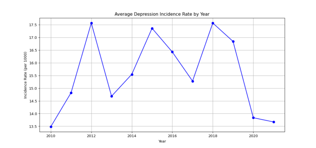
4.1 Average Incidence Rate by Year
We calculate the average incidence rate for each year, allowing us to understand trends over time across all regions.
The resulting table shows the average incidence rate for each year, helping us identify trends such as whether incidence is increasing or decreasing over time. As mentioned in a previous article, the .reset_index() function basically sets the original dataframe back to its original format, after incidence_by_year is created and filled in.
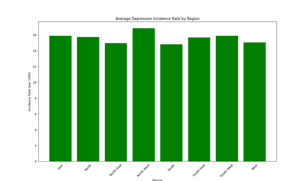
4.2 Average Incidence Rate by Region
We also calculate the average incidence rate for each region, giving insights into which regions have the highest or lowest rates of new depression cases.
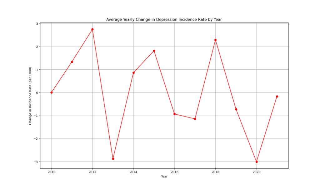
4.3 Average Change in Incidence Rate by Year
Calculating the average change in incidence rate by year helps us understand overall trends in how the rate of new depression cases changes annually.
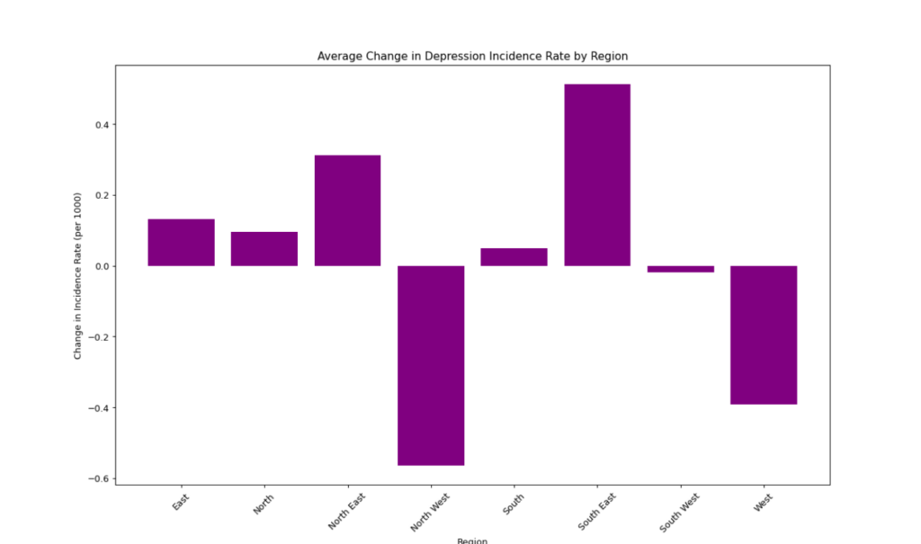
4.4 Average Change in Incidence Rate by Region
We also calculate the average change in incidence rate by region to identify regions where the spread of depression has been accelerating or decelerating the most over time.
Check Values
To check out the values you’ve created, you can just throw a few print statements together. It would be noted that the “\n” is a “new line” character which makes reading much easier as it provides needed spacing.
Step 5: Visualizations
Data visualization is key to communicating our findings effectively. We use matplotlib to create visualizations that illustrate the incidence rate trends and changes over time.
5.1 Line Plot: Incidence Rate by Year
The first visualization is a line plot showing the average incidence rate of depression over the years, allowing us to visualize overall trends in the data. For this graph, alongside the other graphs, we first call plt. with the type of graph we want (whether it be a plot, a bar graph, or something else), then adjusting the title and other aesthetic measures before printing the graph to console.
5.2 Bar Plot: Incidence Rate by Region
We also create a bar plot to visualize the incidence rate across different regions, which helps compare how the disease is distributed geographically.
5.3 Line Plot: Change in Incidence Rate by Year
The next visualization is a line plot that shows how the incidence rate has changed each year. This helps understand whether the disease spread is slowing or accelerating.
5.4 Bar Plot: Change in Incidence Rate by Region
Finally, we visualize the average change in incidence rate by region using a bar plot. This helps identify regions where the rate of depression is changing most significantly in one direction, though may not capture if there is heavy oscillation in a region.
Note: Can Negative Incidence or Change in Incidence Rates Occur?
While calculating yearly changes, negative values can sometimes appear. A negative incidence change indicates that the number of new cases or the rate of new cases has decreased compared to the previous year. This could occur due to effective intervention measures, changes in reporting practices, or natural variability. In some cases, negative values might also reflect inconsistencies in data collection. To supplement incidence data, alternative metrics such as prevalence might be well employed. It should be noted though, that Incidence itself cannot be negative as it only is a measure of new cases in a population, which can only be 0 or a positive number.
Conclusion
In this tutorial, we demonstrated how to calculate and analyze both incidence rates and changes in incidence rates over time using Python. These metrics are fundamental for tracking the spread of diseases like depression, allowing public health officials to understand where interventions are needed most. By calculating incidence rates, observing year-over-year changes, and visualizing these metrics, we gained valuable insights into trends across different regions and years.
Understanding incidence rates and their changes is critical in making data-driven decisions for public health. With Python, such analyses become more efficient and scalable, helping you take a systematic approach to complex health data. We encourage you to apply these methods to other datasets and continue expanding your skills as an epidemiologist or data analyst. Thanks for joining us for another PyFriday, and happy coding!
Humanities Moment
the featured image for this article is Hyacinths (1807) by Robert John Thornton (English, 1768-1837). Robert John Thornton was an English physician and botanical writer, best known for his works “A New Illustration of the Sexual System of Carolus Von Linnæus” (1797-1807) and “The British Flora” (1812). Initially studying at Trinity College, Cambridge, he shifted from theology to medicine, influenced by John Martyn’s botany lectures and Linnaeus’s work. Thornton practiced medicine in London and lectured in medical botany at Guy’s Hospital. His major work, “A New Illustration of the Sexual System of Carolus Von Linnæus,” included the ambitious “Temple of Flora” (1799-1807), featuring thirty-three engraved plates based on paintings, representing an elaborate exploration of plant sexuality.