Epi Explained: What are Epi Curves?
An Epidemic Curve, commonly referred to as an epi curve, is a visual tool used in epidemiology to represent the onset and progression of an outbreak. By graphing the number of new cases over time, public health professionals can analyze the characteristics of an epidemic, such as its source, timing, and mode of transmission. Epi curves are a critical component in outbreak investigations, providing a straightforward yet powerful way to interpret how diseases spread and identify when interventions should occur.
In this Epi Explained, we’ll dive into what epi curves are, the different types, how they are interpreted, and why they are crucial for public health decision-making.
Key Questions
What does an epi curve show?
An epi curve shows the number of new cases of a disease over time. By examining this curve, epidemiologists can identify patterns such as when an outbreak started, how it is progressing, and whether the disease is spreading through a common source or via person-to-person transmission.
What are the three main types of epi curves?
The three main types of epi curves are:
- Point Source Outbreak: A sharp rise and fall in cases, indicating a single source of exposure.
- Continuous Common Source Outbreak: A gradual, flat curve indicating ongoing exposure to the same source.
- Propagated Outbreak: Multiple peaks, showing successive waves of person-to-person transmission.
How do public health officials use epi curves?
Epi curves help public health officials understand the timing, spread, and source of an outbreak. They are used to track disease progression, assess intervention effectiveness, and predict future cases.
What are the limitations of epi curves?
Some limitations of epi curves include data quality issues, challenges in interpretation without additional data, and complexity in cases where multiple sources or transmission methods are involved in an outbreak.
What Are Epi Curves?
An epidemic curve (epi curve) is a type of histogram that visualizes the number of new cases of a disease or health condition over time. The x-axis represents time (e.g., days, weeks, or months), while the y-axis shows the number of cases. By tracking cases across time, epi curves help epidemiologists and public health officials understand how an outbreak evolves, allowing them to identify its potential source, mode of transmission, and peak period.
Epi curves are especially useful during infectious disease outbreaks but can also be applied to other public health events, such as foodborne illnesses, chemical exposures, or natural disasters.
Why Are Epi Curves Important?
Epi curves provide several key insights during an outbreak:
- Understanding the Timing of an Outbreak: Epi curves illustrate when cases start, peak, and decline, allowing public health officials to identify the onset of an outbreak and how quickly it progresses.
- Determining the Source of Exposure: By examining the shape of the curve, epidemiologists can infer whether the outbreak was caused by a single source (point source), continuous exposure, or propagated transmission (person-to-person spread).
- Assessing the Effectiveness of Interventions: Public health interventions, such as quarantine measures, vaccinations, or public education campaigns, can alter the shape of the epi curve. A drop in cases after an intervention indicates its potential success.
- Predicting Future Cases: Based on the pattern of the curve, public health professionals can estimate how many more cases may occur and how long the outbreak will last.
Components of an Epi Curve
To interpret an epi curve effectively, it’s essential to understand its core components:
- X-Axis (Time): The horizontal axis represents time, typically in units like days, weeks, or months, depending on the outbreak’s duration. This axis shows when cases occurred. It should be noted that as the dynamics of an outbreak change, it’s possible that the best time scale for representing that outbreak may also change to better inform operations or the public.
- Y-Axis (Number of Cases): The vertical axis shows the number of cases (or other health events) occurring within each time period.
- Bars or Columns: Each bar on the graph represents the number of new cases during a specific time period. By looking at the height of the bars, epidemiologists can assess the rise and fall of cases.
Example of an Epi Curve in Action
Imagine an outbreak of a foodborne illness, such as salmonella. The epi curve shows when the first cases were reported and tracks the spread of the illness over time. If the cases spike quickly and then decline just as rapidly, it suggests a point-source outbreak, where all individuals were exposed to the pathogen around the same time (e.g., at a contaminated restaurant who got a bad batch of an ingredient). If cases rise more gradually and stay elevated over a longer period, it may indicate ongoing exposure or person-to-person transmission.
Types of Epi Curves
There are several types of epi curves, each representing different outbreak patterns:
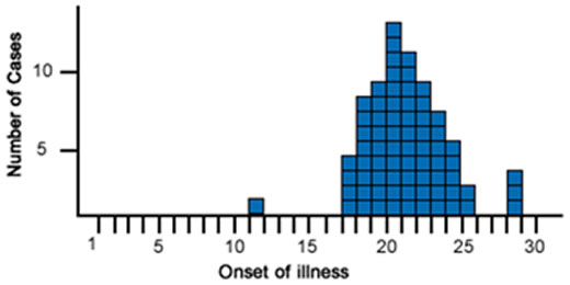
- Point Source Outbreak: In a point source outbreak, individuals are exposed to the same source of infection at the

An example of a Point Source Outbreak Epi Curve. (Source: CDC) same time. The epi curve for a point source outbreak typically shows a sharp rise in cases, followed by a gradual decline. An example would be a food poisoning incident where individuals who ate contaminated food develop symptoms within a few hours or days of exposure.
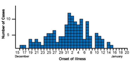
- Continuous Common Source Outbreak: In a continuous common source outbreak, individuals are exposed to the infectious agent over a longer period.

An example of a Continuous Common Source Outbreak Epi Curve. (Source: CDC) The epi curve tends to be flat, as new cases continue to occur as long as the source remains active. For example, contaminated water in a community may cause new cases of illness to appear regularly until the water source is cleaned or shut down.
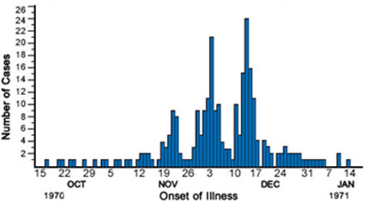
- Propagated Outbreak: In a propagated outbreak, the disease spreads from person to person, leading to successive “waves” of cases.

An example of a Propagated Outbreak Epi Curve. (Source: CDC) The epi curve for a propagated outbreak shows multiple peaks, each corresponding to a new generation of transmission. This pattern is commonly seen with highly contagious diseases like measles or the flu.
Visual Comparison of Epi Curves
- Point Source Curve: The curve rises sharply and then falls, resembling a peak. This suggests that many people were exposed at once, and the outbreak was brief.
- Continuous Source Curve: The curve is more gradual and flat, as new cases arise over time due to ongoing exposure.
- Propagated Curve: The curve shows a series of peaks, with each new peak representing a subsequent wave of infections due to human-to-human transmission.
How to Interpret an Epi Curve
Interpreting an epi curve requires considering several factors:
- Shape of the Curve: The shape of the epi curve provides clues about the type of outbreak. A sharp peak suggests a point source, while a flat curve with sustained cases suggests continuous exposure. Multiple peaks suggest propagated transmission.
- Time of Onset: The date when cases first appear on the curve indicates when the outbreak likely started. For infectious diseases, this information helps estimate the incubation period, which is the time between exposure and the onset of symptoms.
- Peak of the Outbreak: The highest point on the curve represents the peak of the outbreak, where the most cases occurred in a given period. Identifying the peak helps gauge when the outbreak was at its worst and when it might start to decline.
- End of the Outbreak: The point where the curve returns to baseline (i.e., when no more new cases are reported) indicates the end of the outbreak. If the curve doesn’t return to baseline quickly, it may signal ongoing transmission or incomplete containment efforts.
The Role of Epi Curves in Outbreak Investigations
Epi curves are indispensable in the field of outbreak investigations. When a disease outbreak occurs, public health officials need a rapid and reliable way to understand how the outbreak is unfolding and where to intervene. Epi curves offer a real-time visualization of case progression, helping investigators to:
- Determine the source of infection: By pinpointing the earliest cases and understanding the shape of the curve, epidemiologists can trace the source of exposure (e.g., contaminated food, infected individuals, or environmental hazards).
- Identify the mode of transmission: The shape of the curve can reveal whether the disease is spreading through contaminated sources (point or continuous exposure) or through person-to-person contact (propagated transmission).
- Evaluate the impact of interventions: As public health interventions, such as vaccination campaigns or quarantine measures, are implemented, the shape of the epi curve may change, indicating the effectiveness of these strategies.
Limitations of Epi Curves
While epi curves are valuable tools in public health, they have some limitations:
- Data Quality: The accuracy of an epi curve depends on the completeness and timeliness of the data. Delays in reporting or incomplete case data can lead to a distorted view of the outbreak’s progression. During normal outbreak investigations and response, data quality will often be uncertain, so using best practices and what is available is generally accepted.
- Interpretation: Epi curves alone cannot provide conclusive evidence about the cause of an outbreak. Additional epidemiological data, such as patient interviews, laboratory tests, and environmental assessments, are often needed to confirm the source of the outbreak.
- Complex Outbreaks: In outbreaks with multiple sources or varying transmission modes, the epi curve may be difficult to interpret, as it might show overlapping patterns that don’t fit neatly into the standard outbreak types (point source, continuous, propagated).
Conclusion
An epidemic curve is a vital tool in epidemiology, providing a visual representation of how a disease outbreak progresses over time. By tracking the number of new cases across time intervals, public health professionals can identify the source of the outbreak, determine how the disease is spreading, and assess the effectiveness of interventions.
Although epi curves cannot explain everything about an outbreak, they are an essential starting point for public health investigations and are often used in conjunction with other epidemiological tools to uncover the root causes of disease outbreaks and inform public health actions.
Humanities Moment
The featured image for this installment of Epi Explained is Winter’s Cabin at the Curve by Birge Harrison (American, 1854–1929). Lovell Birge Harrison was an American landscape and genre painter, teacher, and writer, known for his advocacy of Tonalism. Born in Philadelphia, he studied under Thomas Eakins, Carolus-Duran, and at the École des Beaux-Arts, becoming one of the first American artists to have work purchased by the French government. Harrison, influenced by atmospheric painting techniques, became a leader of the Tonalist school after moving to Woodstock, New York, where he founded a painting school. He was a celebrated artist and writer, receiving numerous accolades and publishing influential works on landscape painting, emphasizing honest observation of nature.
Thank you for reading this Epi Explained. If you’d like to learn more about epidemiology, public health, programming or other key topics, please check out more of our website!
